EF Ultimate Break
Color Palette
Role: Creative Direction, Graphic Design
Once travel resumed after the challenges of the COVID-19 pandemic, Ultimate Break saw a huge surge in interest. Our color palette throughout the pandemic was fairly muted: heavy in pastel tones, and featuring just two main values: blue and orange. As travel returned with a vengeance, the palette started to feel stale; it needed more vibrancy and energy to meet the moment.
Working in collaboration with our Vice President of Marketing, I identified the criteria that a new set of colors must meet in order to satisfy brand, creative, and marketing objectives, and then embarked on a 3-month effort with my design team to develop the new palette.
My role was to lead the team through a brand survey, color trend research, competitive analysis, countless debates about shades of red, and lots of iterating, testing, and refining across many different channels. Once the palette was locked in, I also coordinated and managed the rollout across all our platforms.
Before

The old palette had many similar color values (and a huge number of tints and shades) making it difficult to set distinct usage guidelines.
After
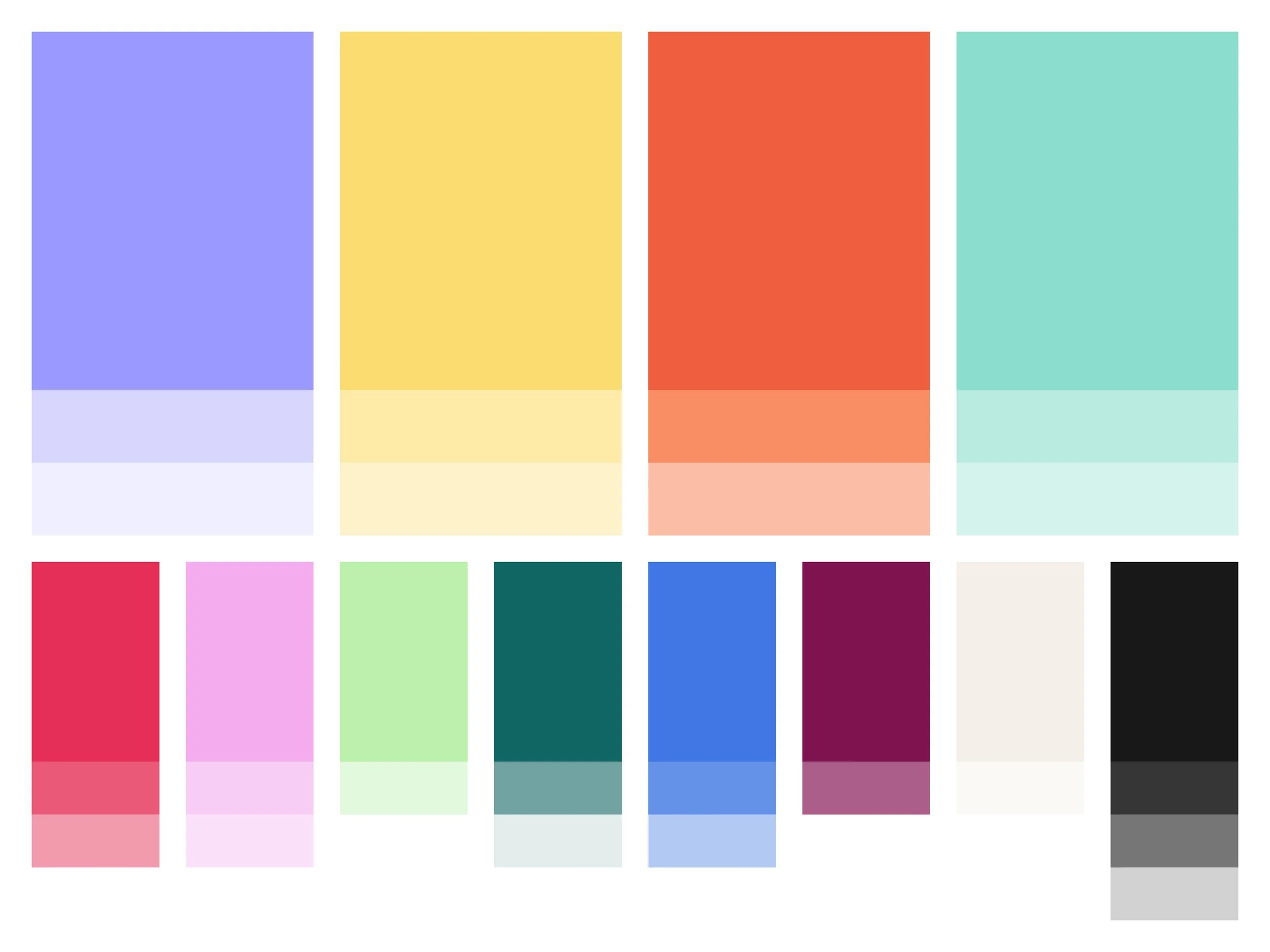
While it features a wider spectrum of colors, the new palette has fewer tints, each of which was discussed in-depth to ensure the team would make full use of them.
Color Refresh Goals
01 / Color diversity
The previous Ultimate Break color palette consisted of blues and oranges, which worked great with warm-toned locations (Greece and Italy), but clashed with photos that featured a lot of greens, reds, or purples. The new palette has a much wider spectrum of color values.
02 / Stronger visual impact
The new palette offers more saturation and boldness (with fewer pastels) to match the energy and excitement that comes with travel. There are a range of lights, mediums, and darks, with the ability to pack a punch for promotions and be softer when messaging dictates.
03 / Future flexibility
Trending colors come and go with a Gen-Z and Millennial audience, so it was important that the new palette was expansive enough to stretch in different directions as needed. Replacing or dropping a color to keep things fresh is an active consideration we look at each year.
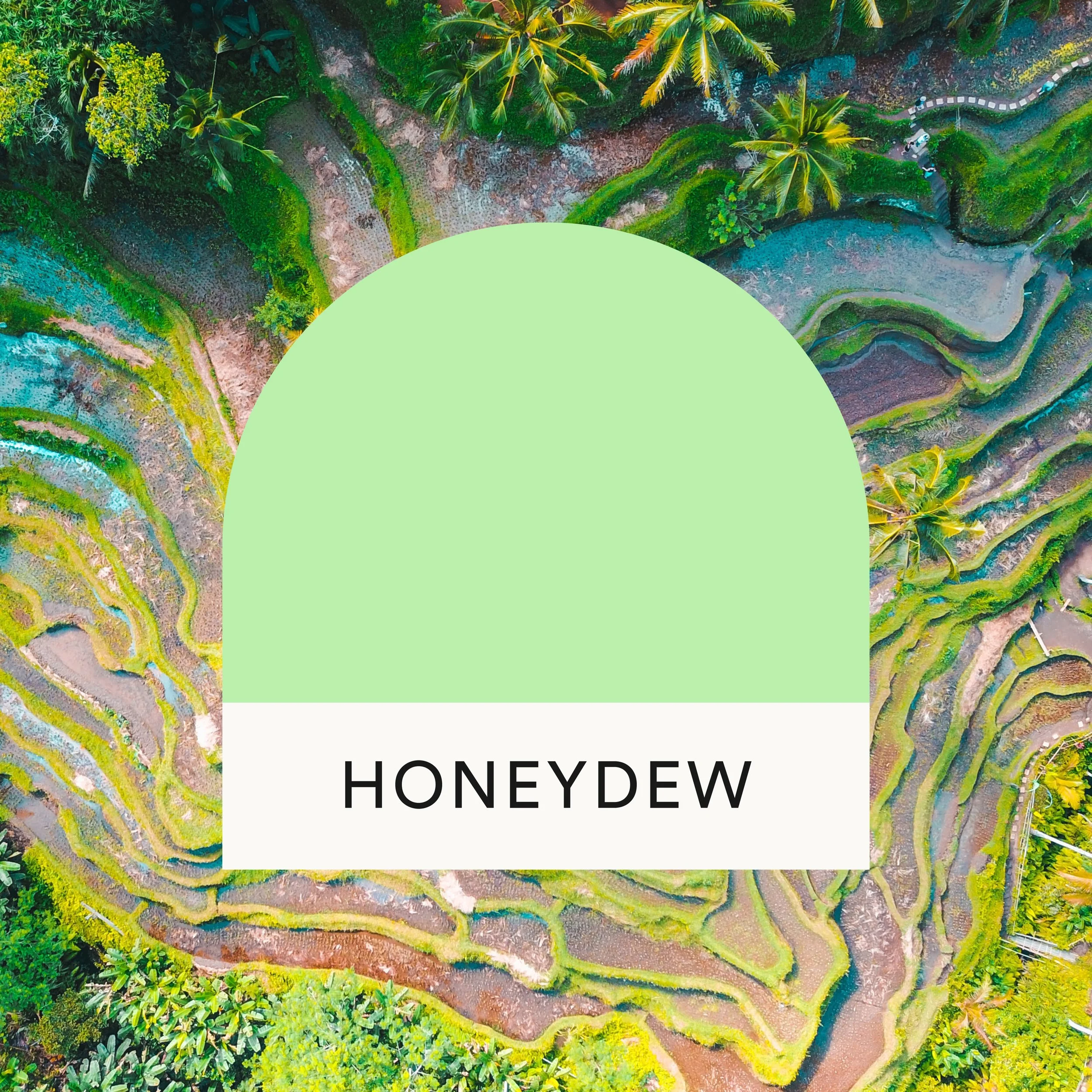
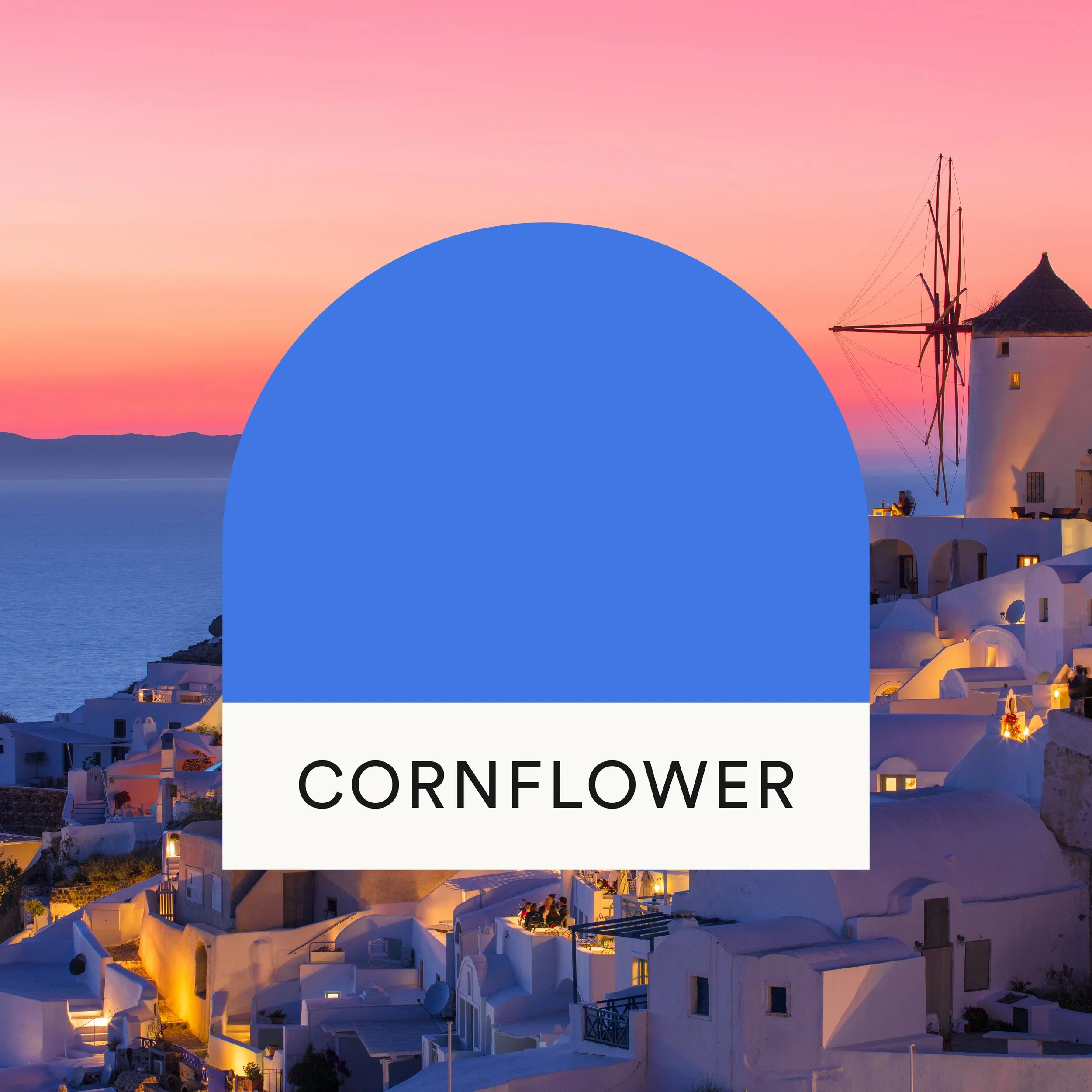
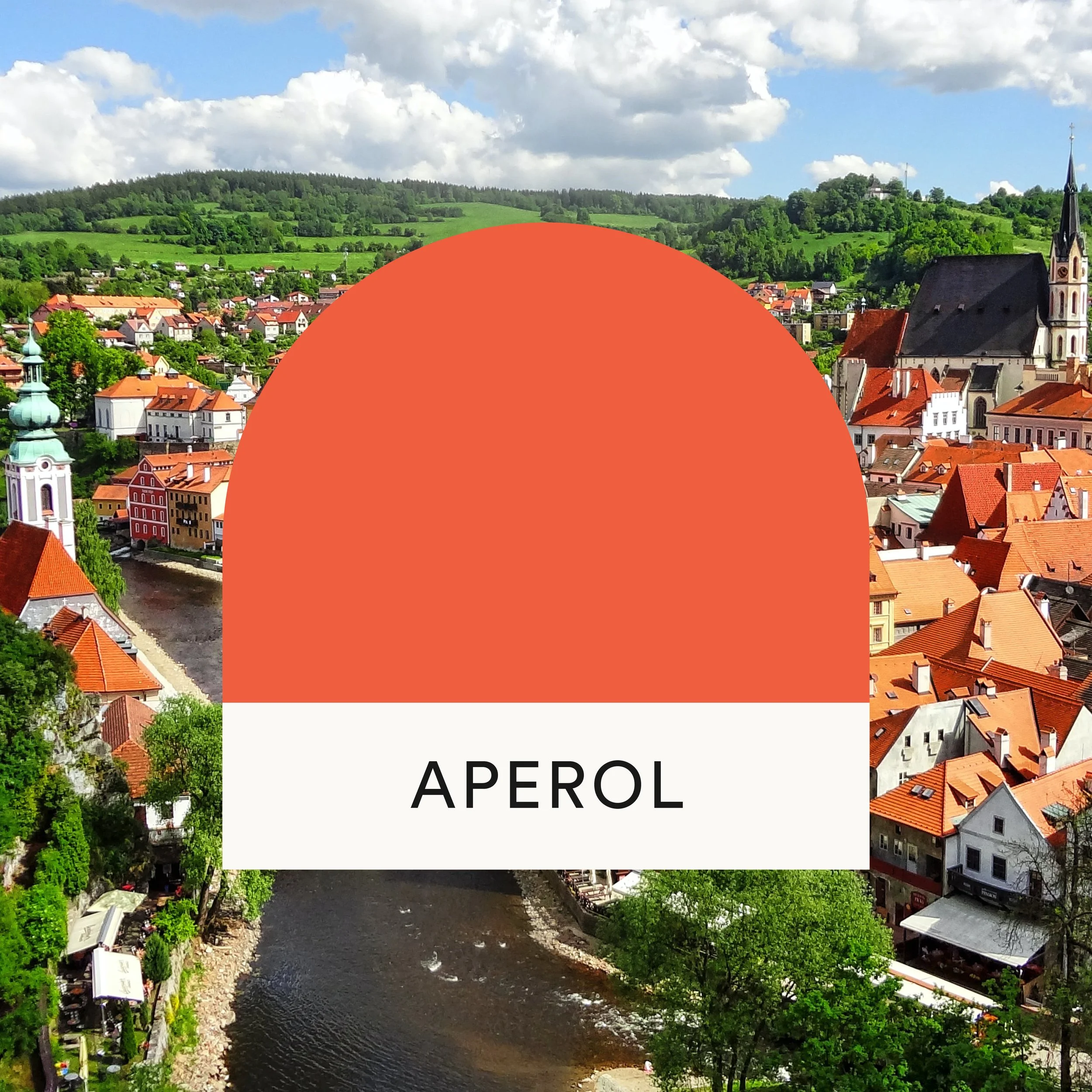
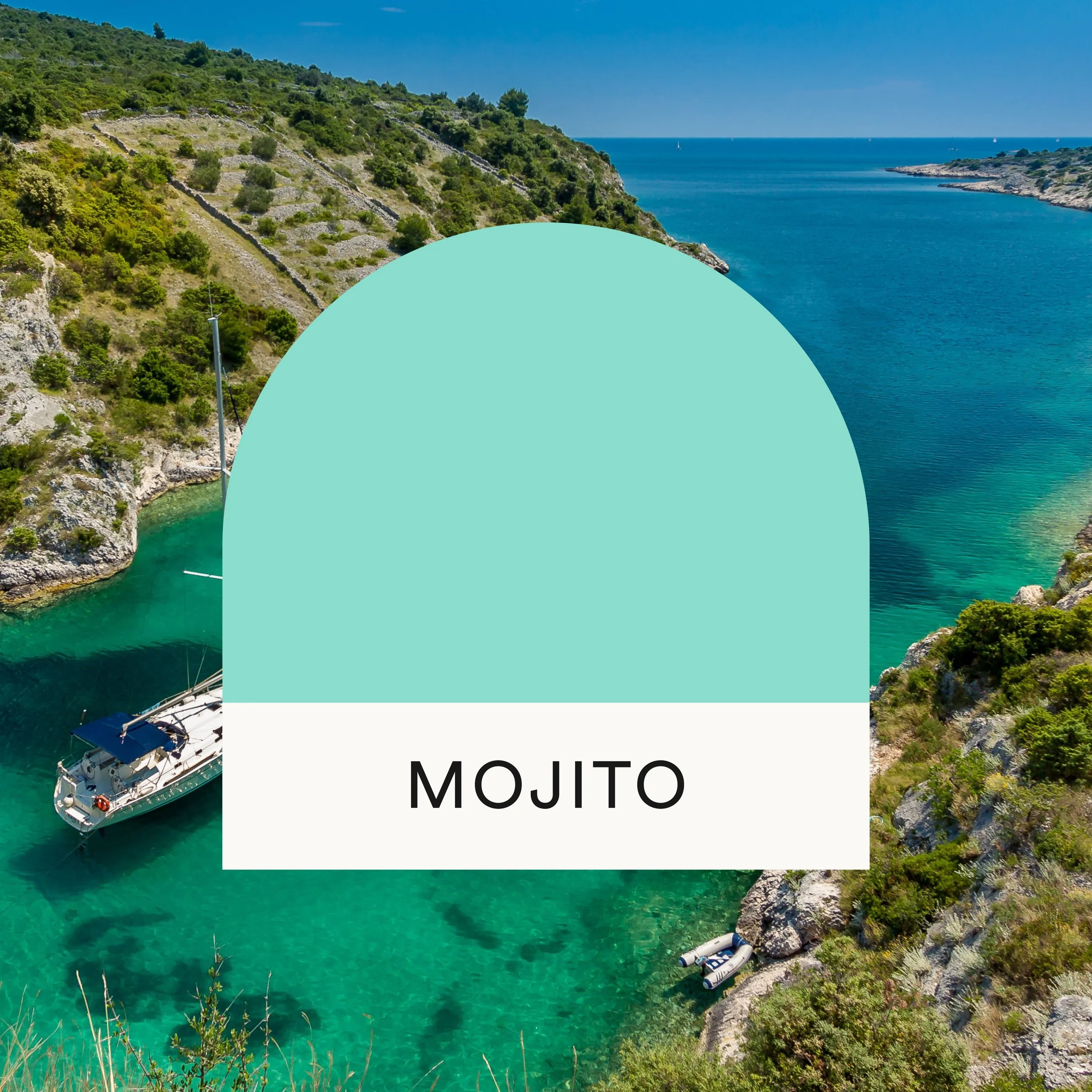
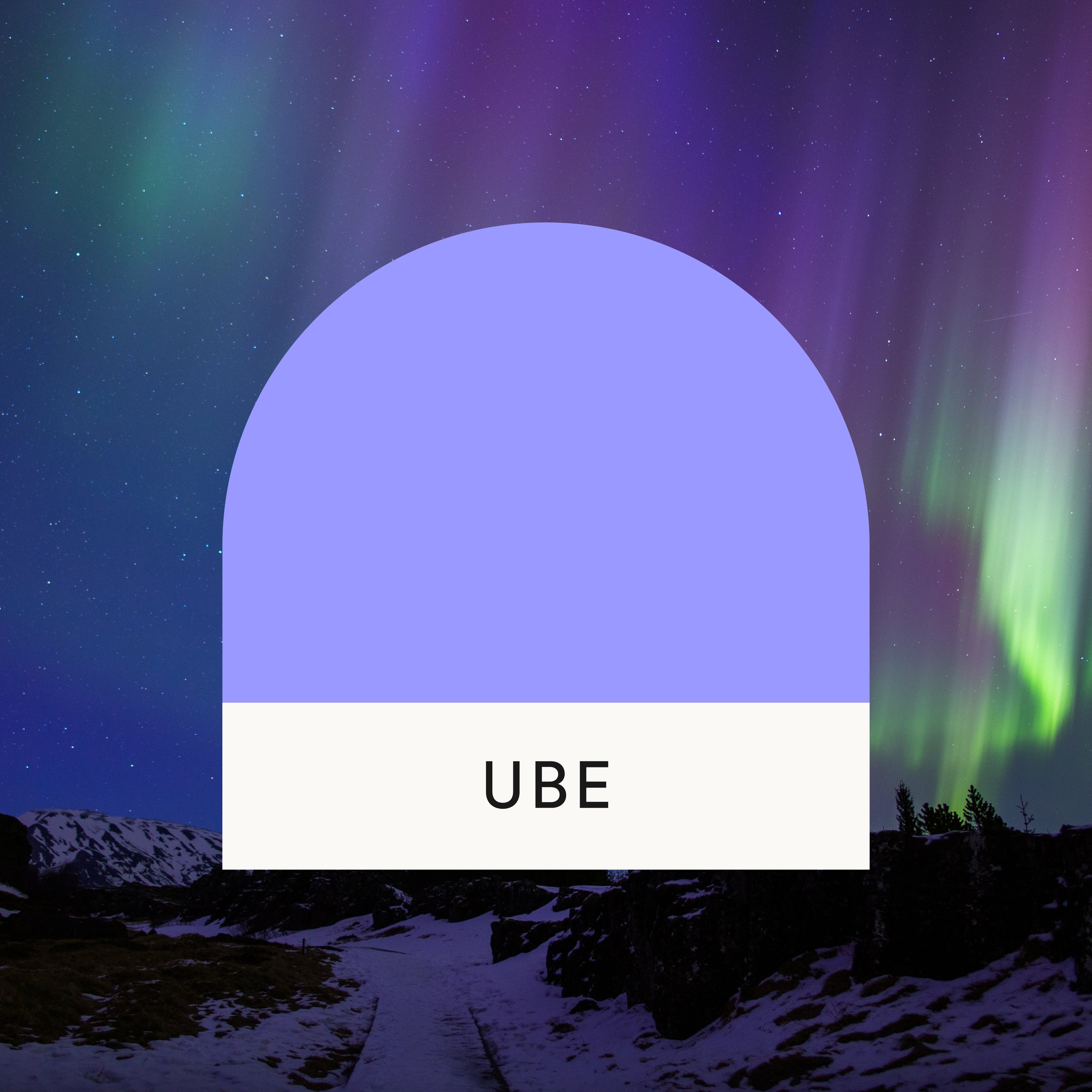
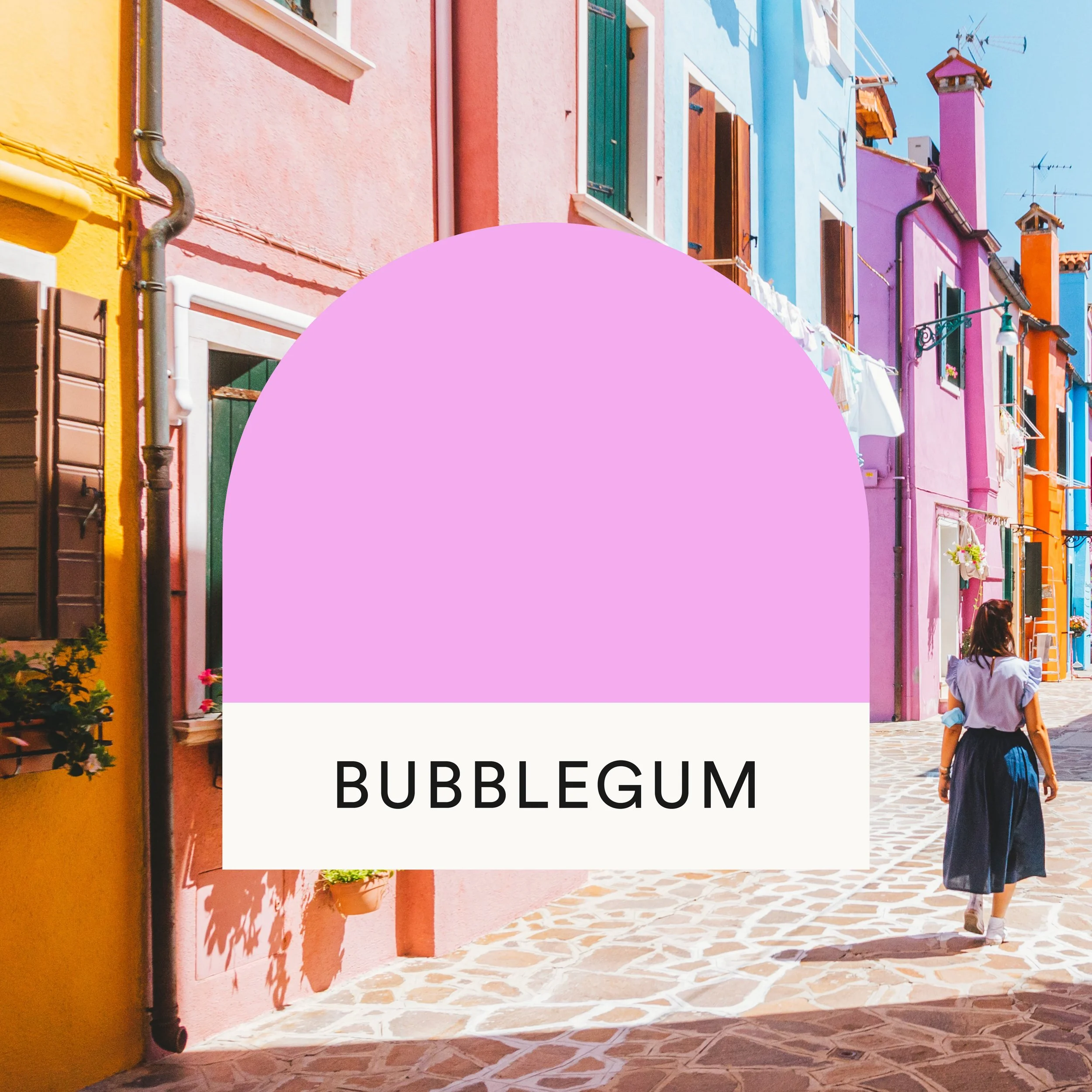
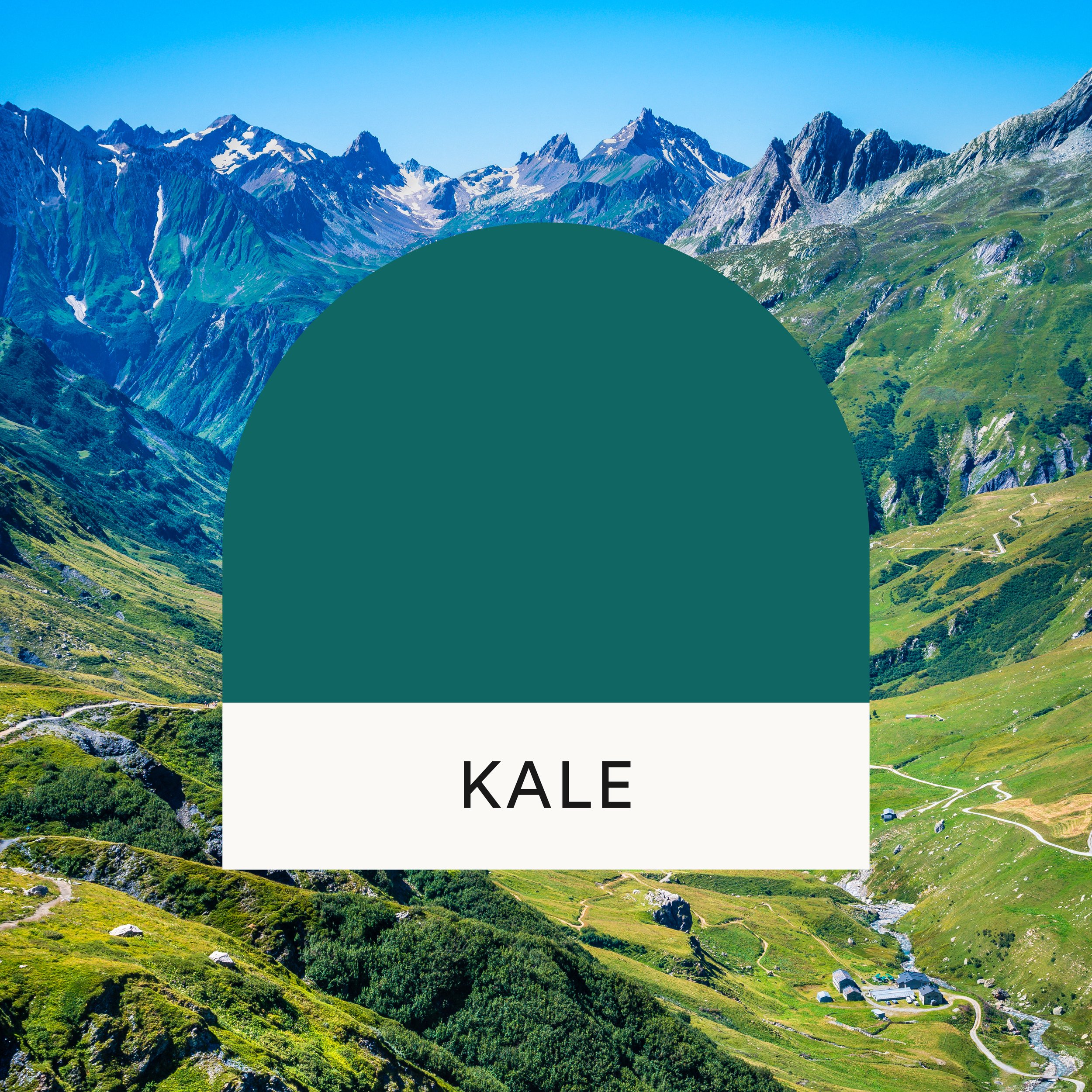
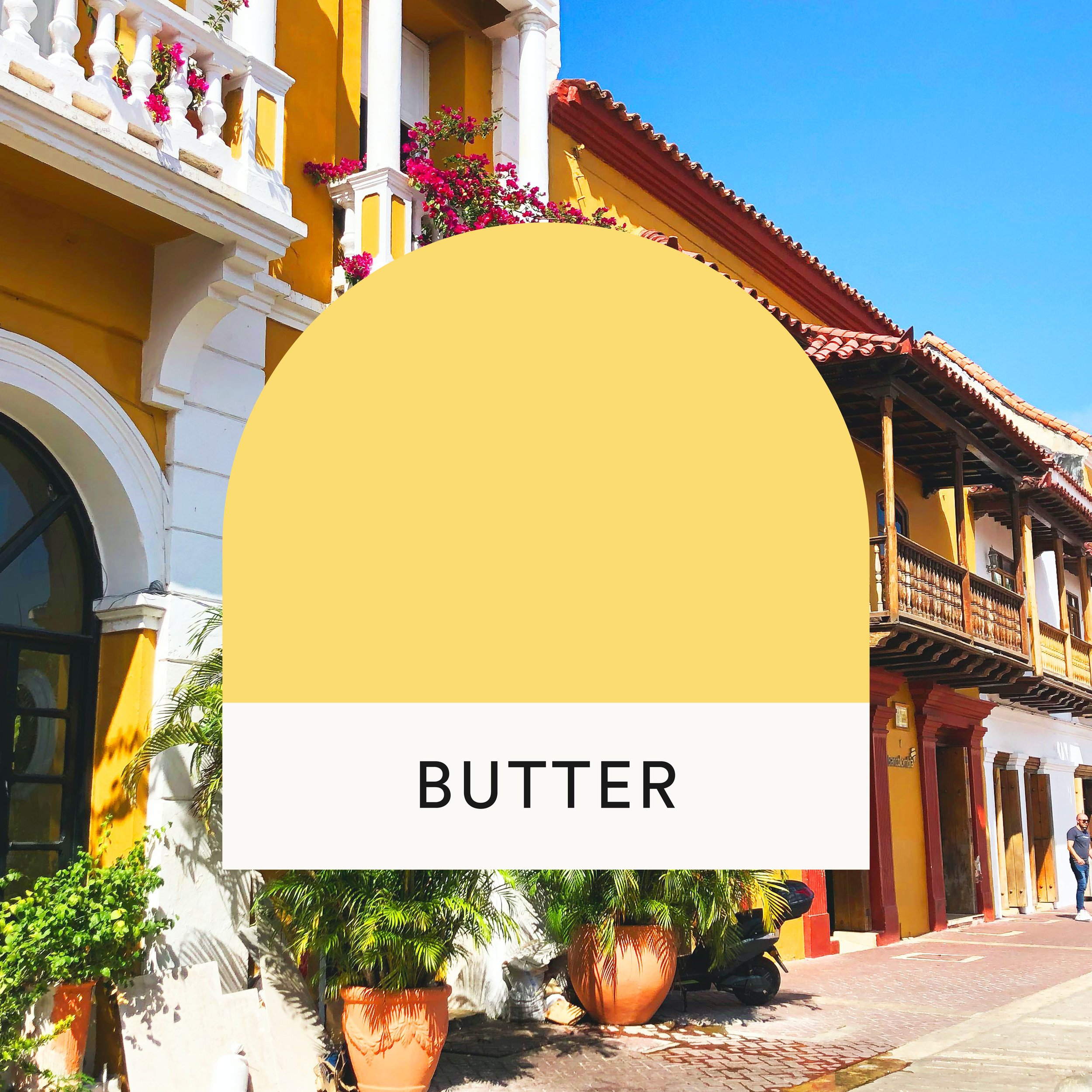
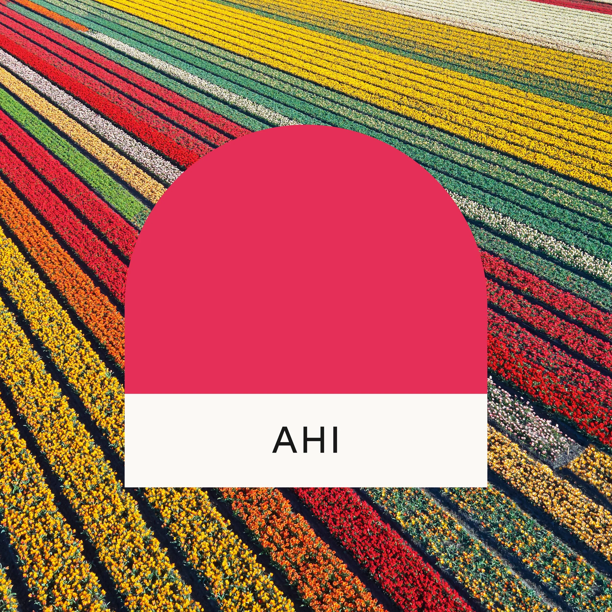
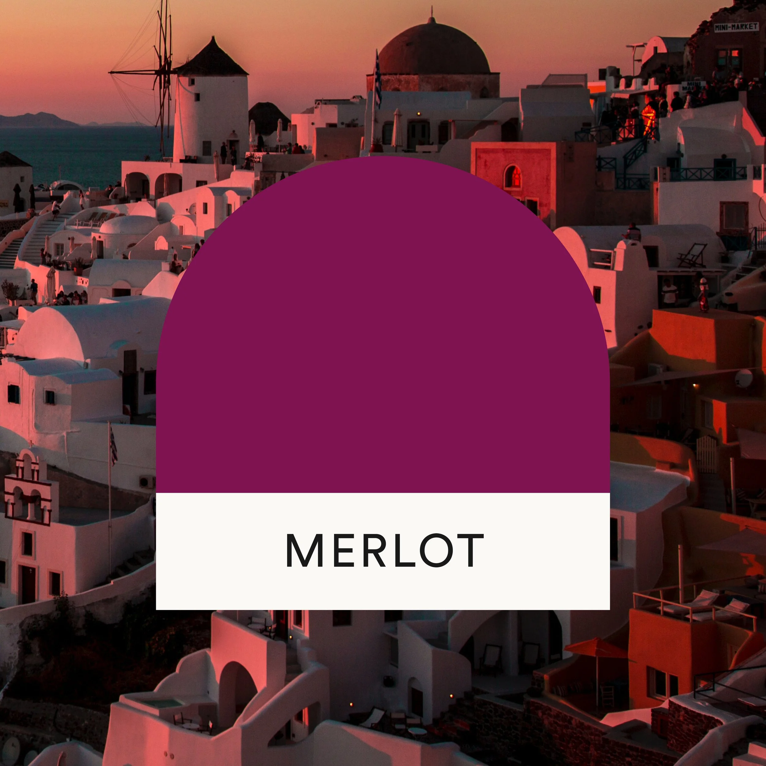
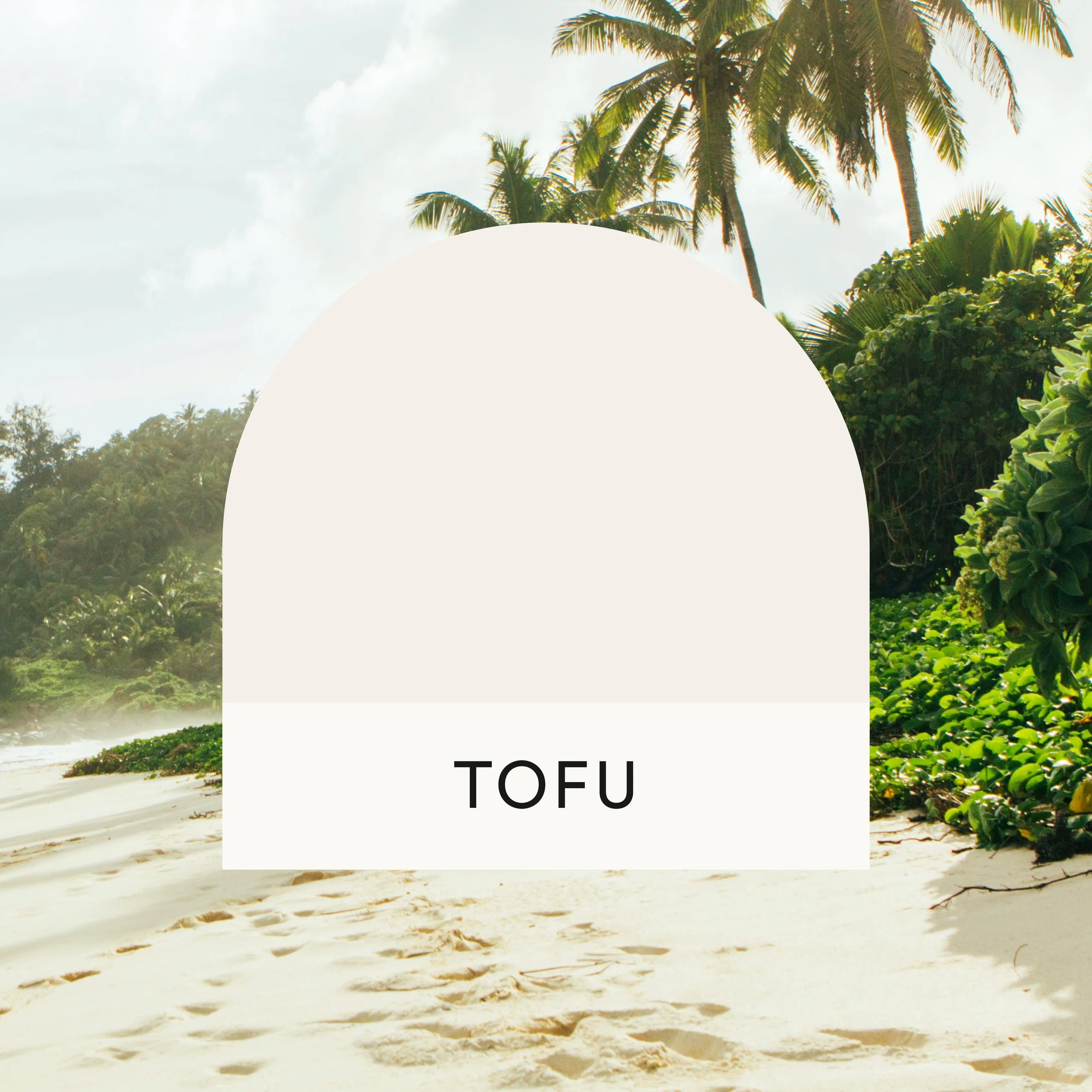
With so many colors in our palette, it was important to identify usage guidelines. We rely most heavily on our “core four” colors of Ube, Butter, Aperol, and Mojito. The secondary palette of brights and darks offers flexibility and contrast. A simple neutral palette of a light and a dark even out all the color.
Gradients
Gradients were part of Ultimate Break’s color approach prior to the refresh, and we opted to keep them in the mix with some adjustments. Our new gradients offer more subtlety this time around (values near each other on the color wheel blended together). In general, they give us additional depth and texture to play with.
Project Team
The small but mighty EF Ultimate Break design team:
Cameron Walsh (design)
Kateri Gemperlein-Schirm (design)