
MOO Brand Guidelines
When I joined MOO, the creative team (nearly 25 strong, split across London and Boston offices) had no brand guidelines, despite a well-developed visual aesthetic and tone of voice. We needed a document that would ensure clarity and consistency around key brand elements, such as the logo, color palette, typography, and photography. The guidelines were also created as a useful resource for onboarding new staff and vendors.
My role
I wrote and designed the brand guidelines from scratch, leading the design team through a months-long process to nail down the details, and ensuring the document was something we all contributed to and collectively owned.
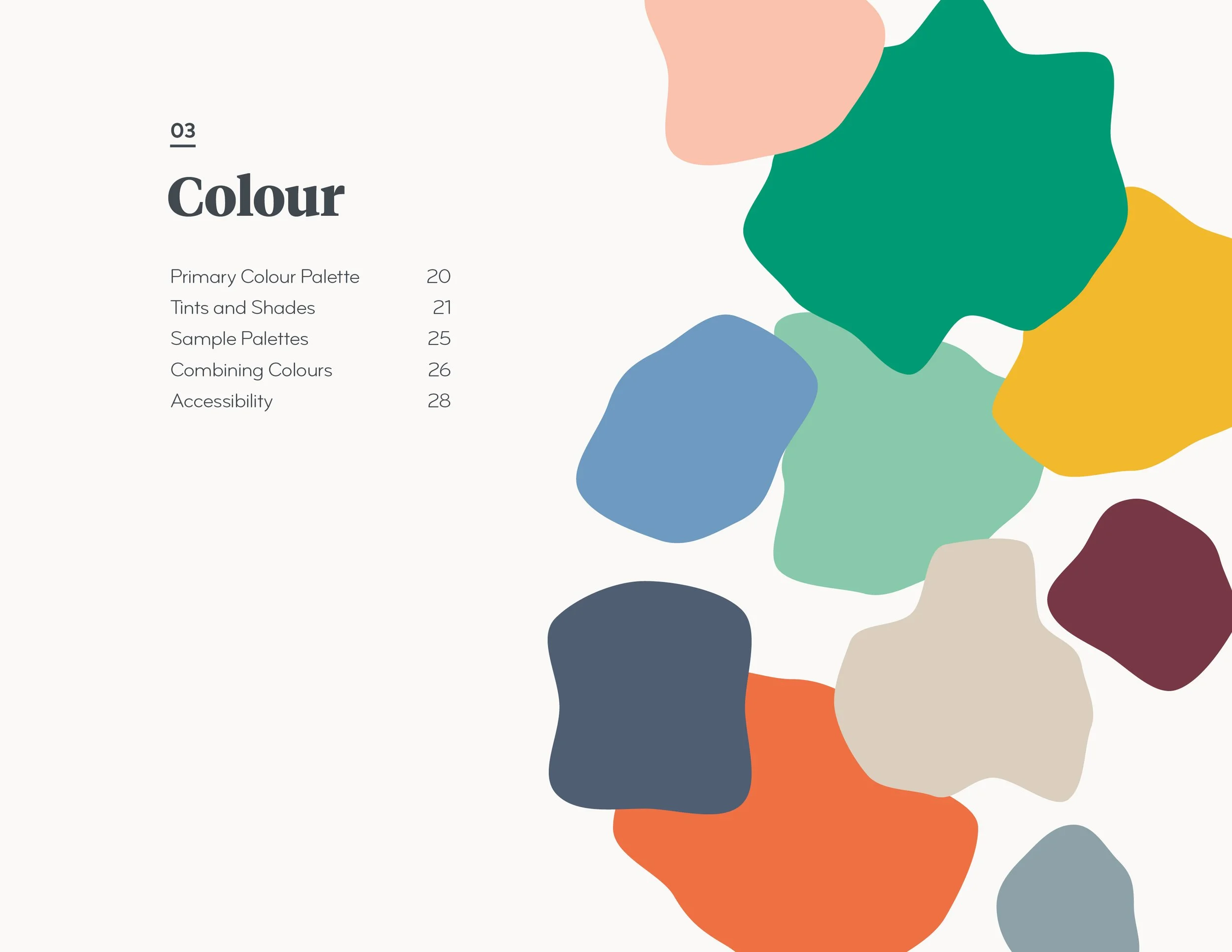
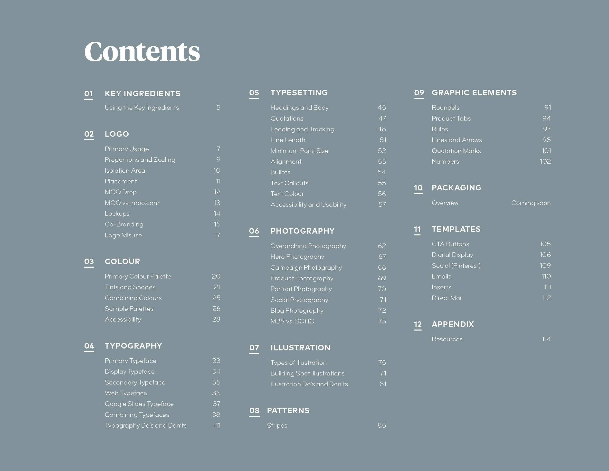
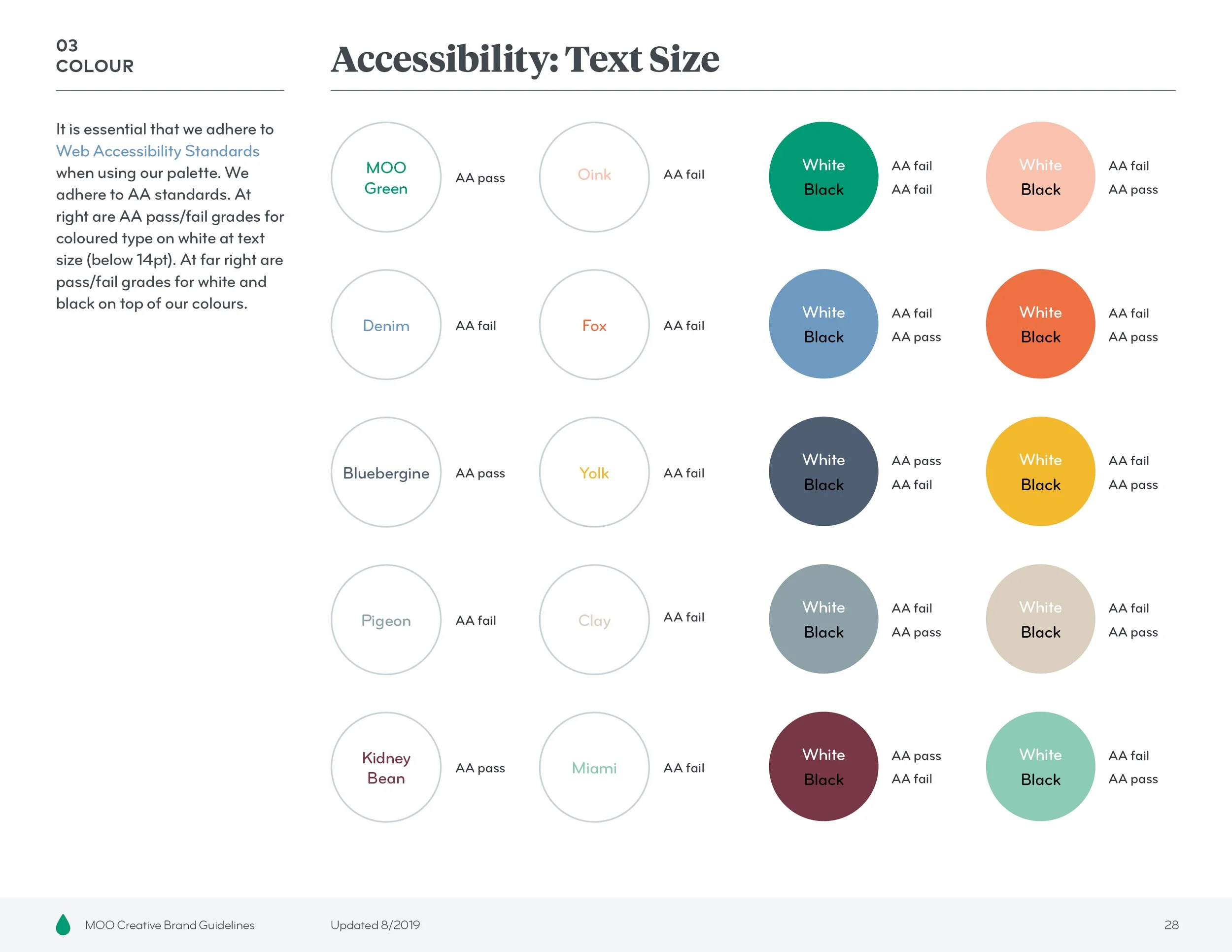
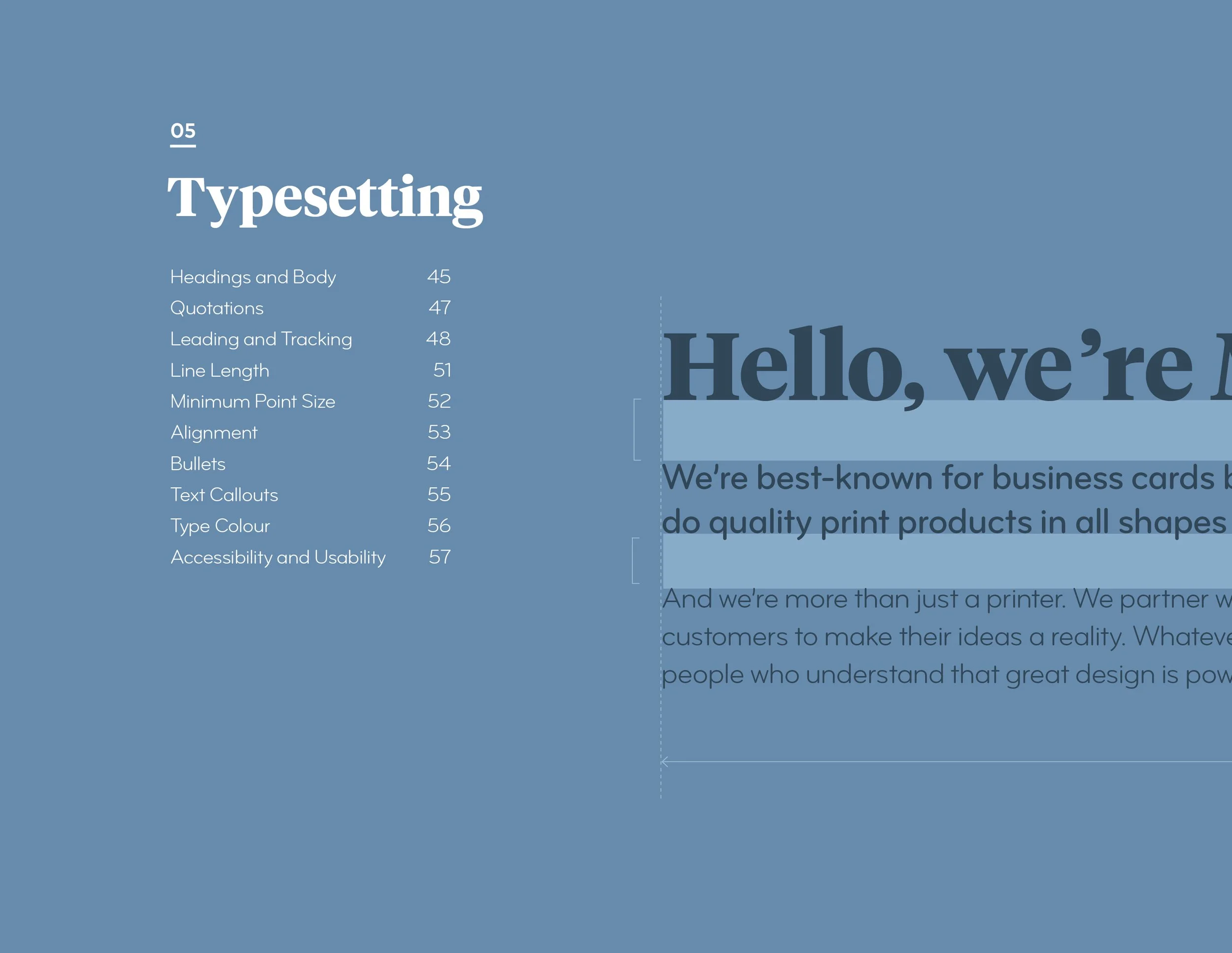
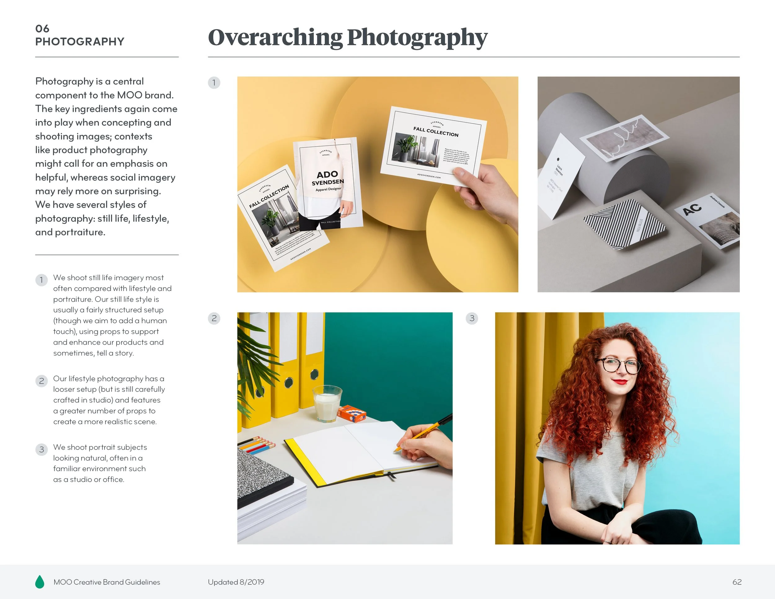
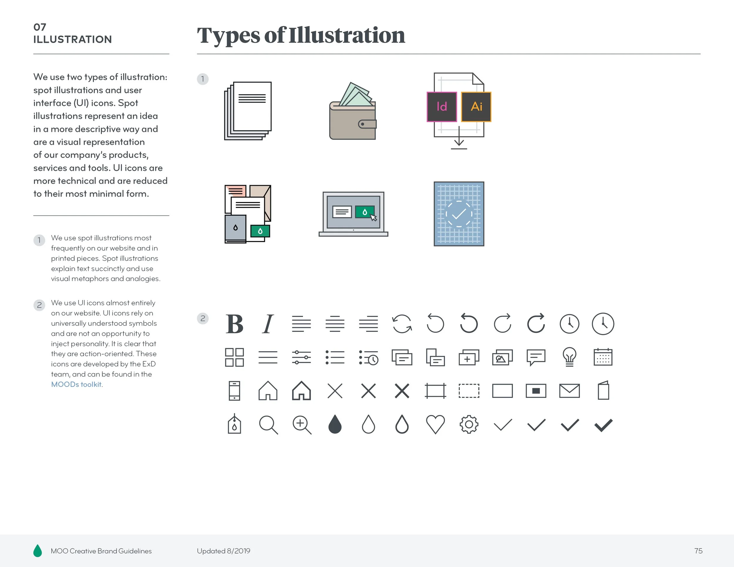
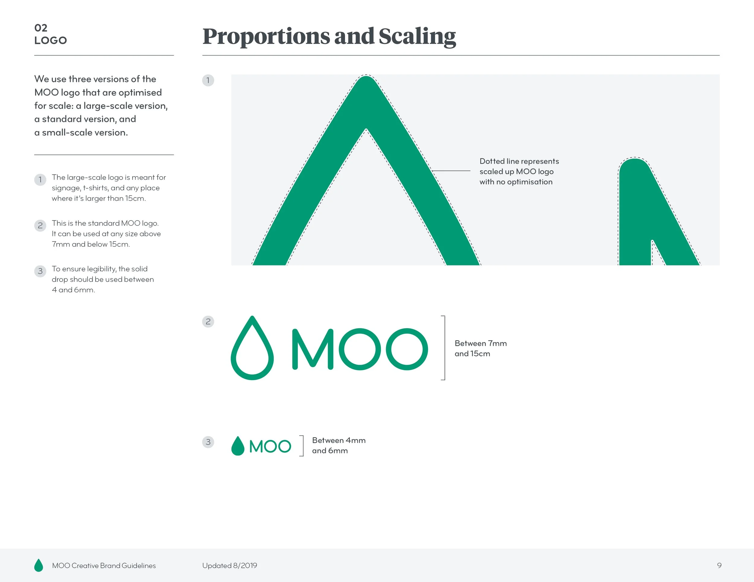
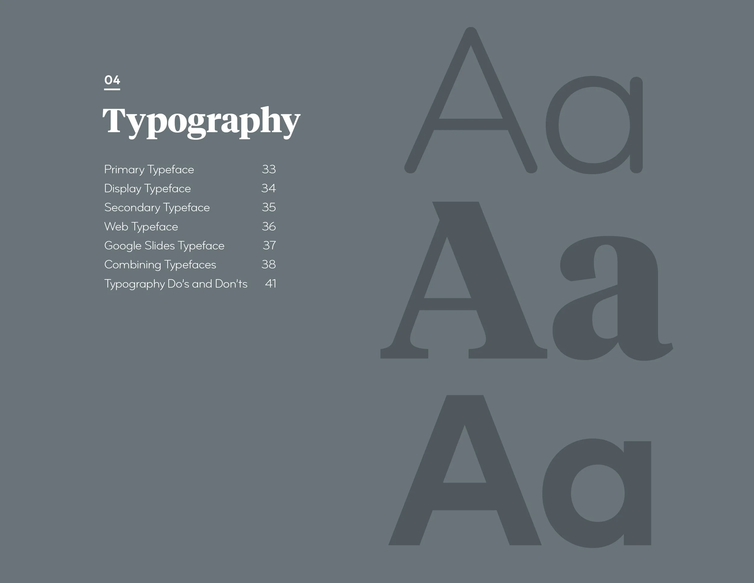
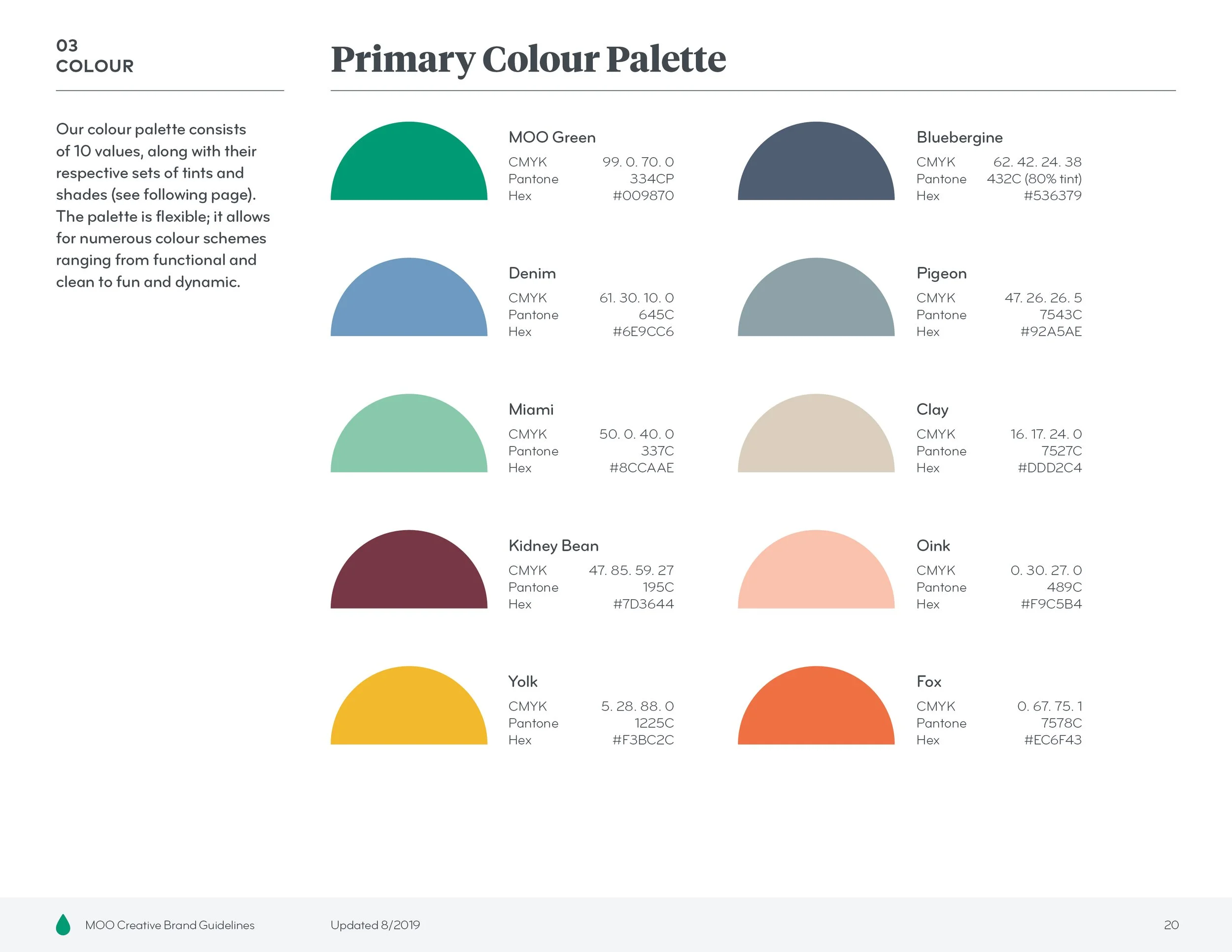
At times, this meant formally documenting the ways in which we were already using certain elements. It also meant developing new rules where there were none, as well as taking an extensive look at our typography, ultimately bringing another typeface into the mix. Example pages from the (very long and detailed!) document are shown below.


Project Team
The amazing MOO design team (Sarah Daley, Millie Davies, Anna Ebubedike, Matt Avery, Steve Turner, Phil Bailey, Jon Misarski, and Em Stokes) all contributed to this work.